Work · Consumer Goods
BoieUSA · VBL
An ongoing collaboration with BoieUSA to design its line of personal care products. A Visual Brand Language makes every new product part of the same family, from the shower to the sink.
Project details
- Client
- BoieUSA
- Sector
- Personal care
- Services
- Industrial Design, Visual Brand Language, Product line
Challenge
BoieUSA makes shower and oral care products with soft, durable materials. As the range grows, each new product needs to feel part of the same brand while solving its own use.
The challenge was to define a shared design language that can grow with the line, product by product, without starting from zero each time.
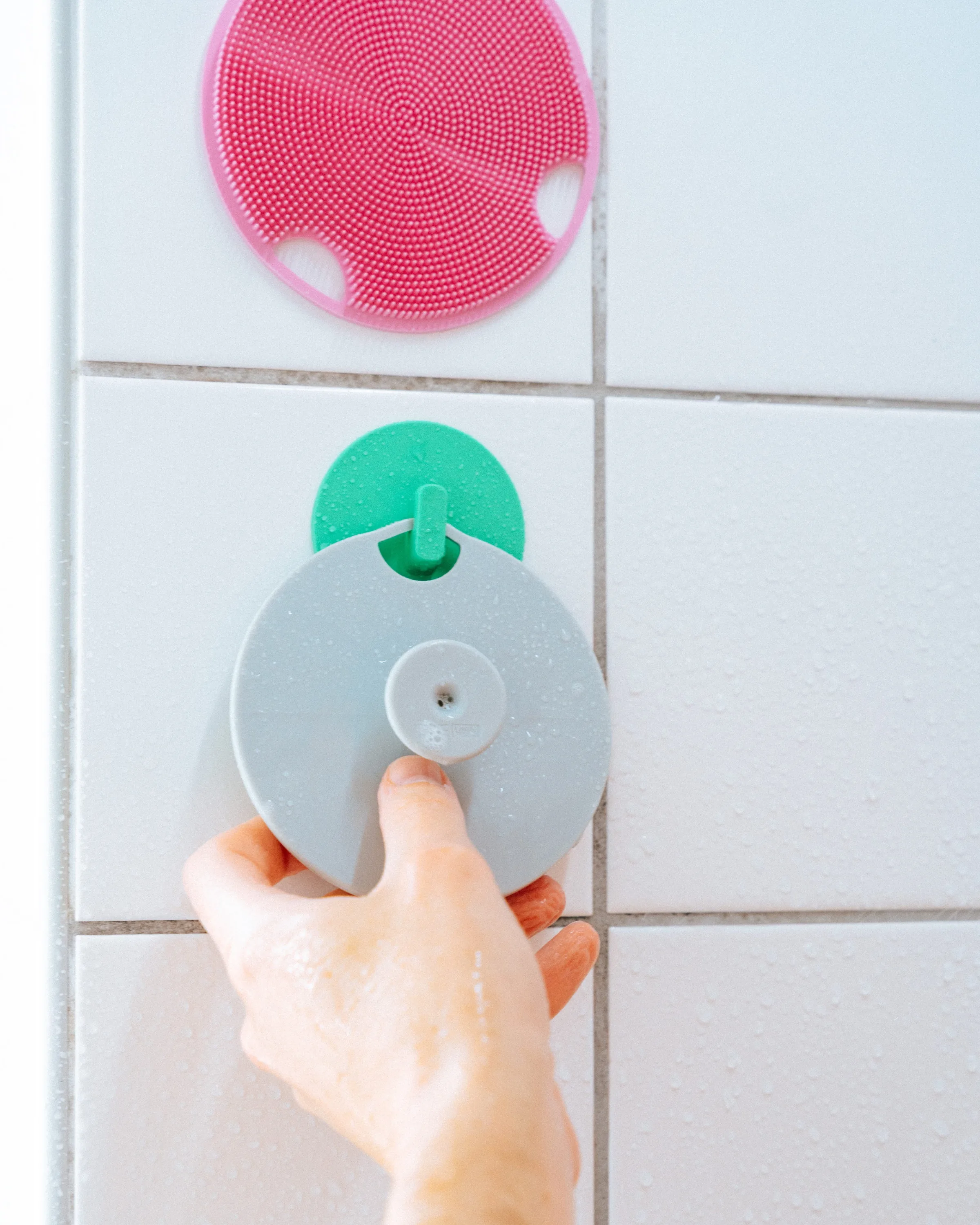
Key outcomes
One family, many products
Shared radii, proportions and textures make every new product recognizable as BoieUSA.
Messages molded into the product
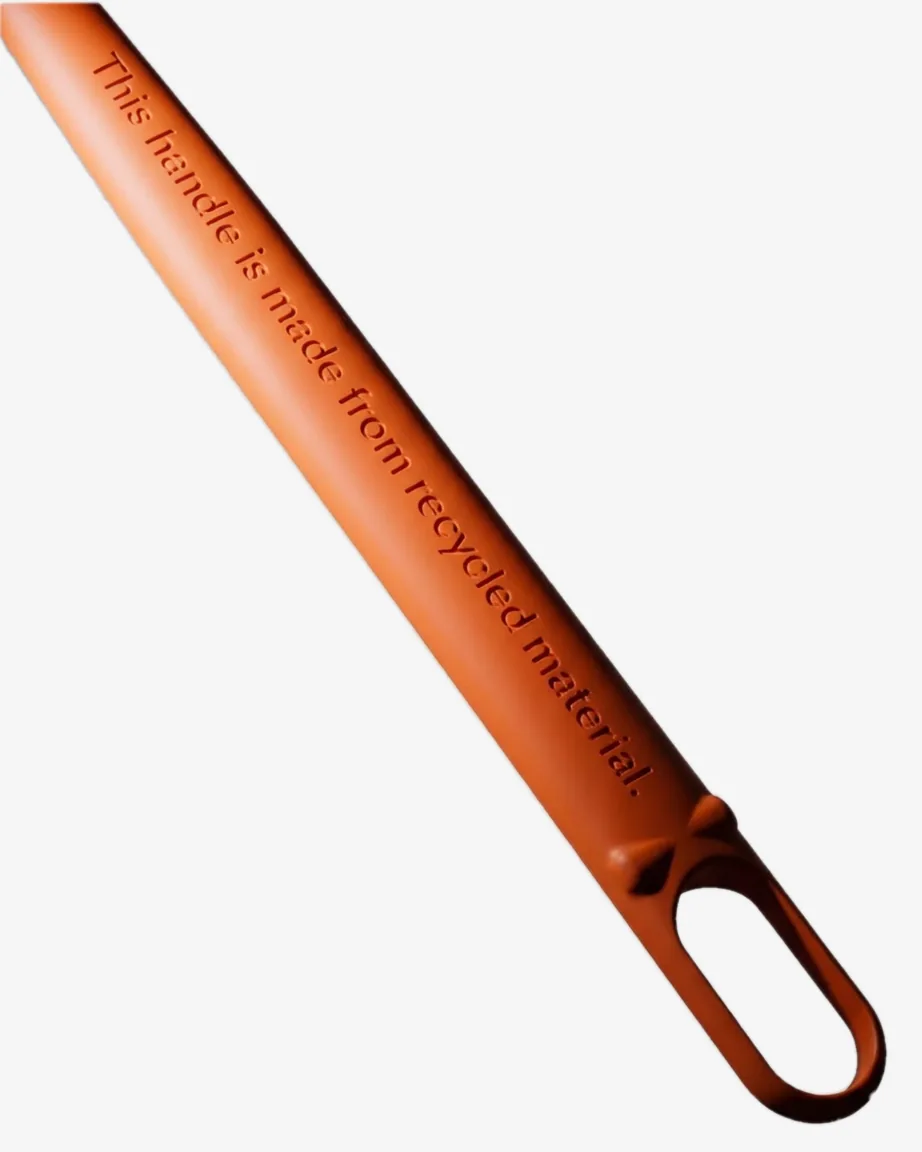
Short messages like Made in USA or Made from recycled material are part of the form, not a label.
Designed to hang and dry
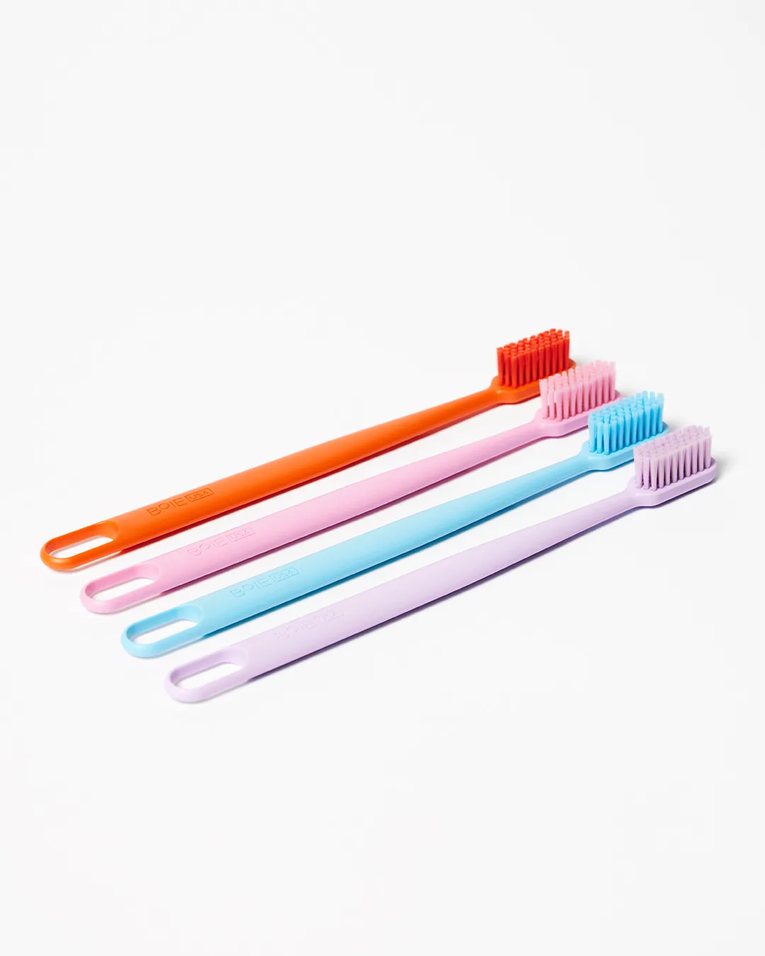
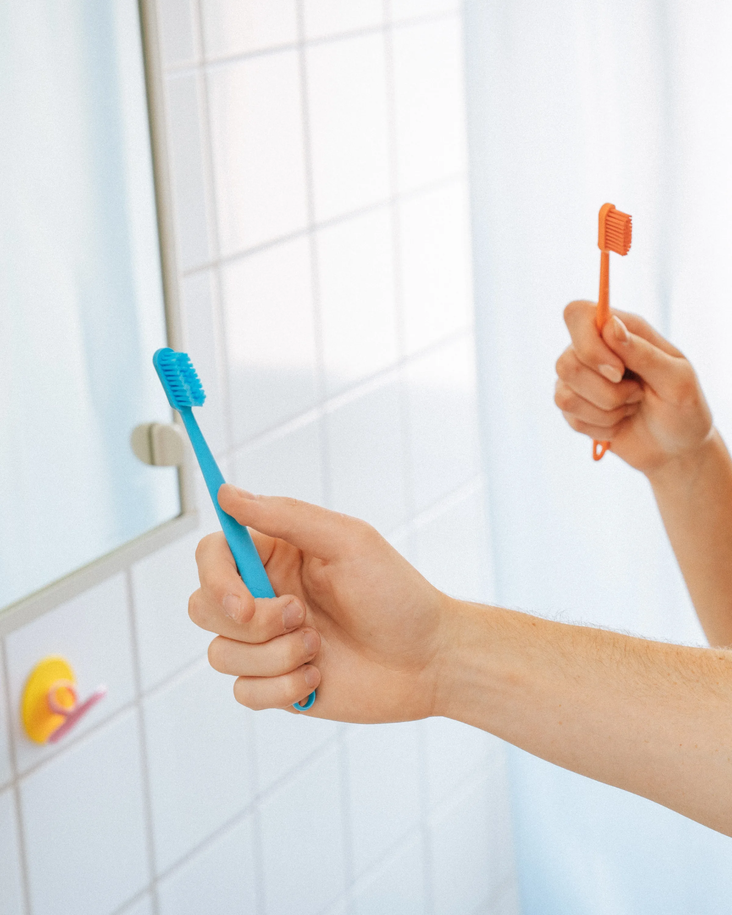
Loops and openings let each product hang in the shower or on a hook, off the counter.
Solution
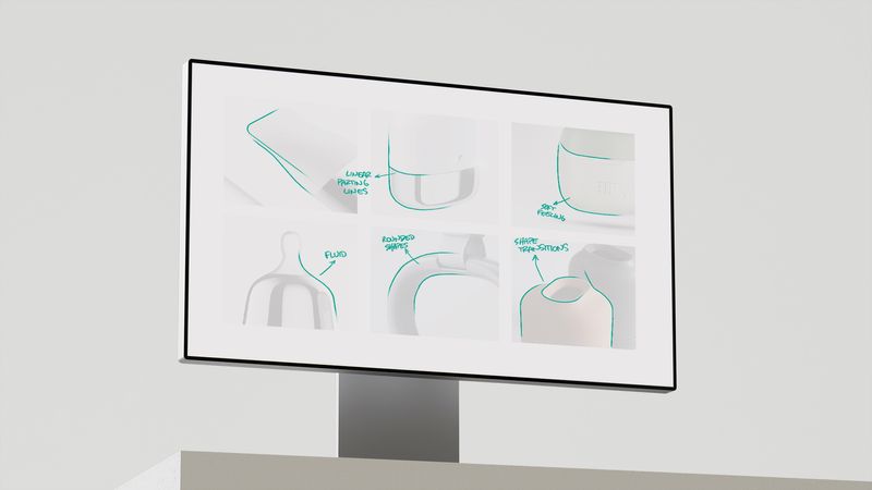
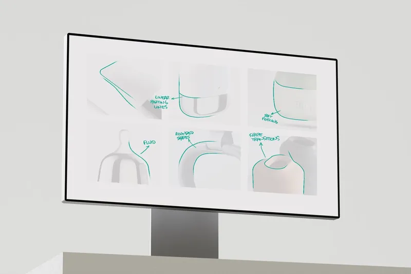
A Visual Brand Language built on a few clear rules. Generous radii and soft proportions, so every product feels friendly in the hand. Textures made for each task, from fine bristles to massaging tips. A loop or opening to hang each product and let it dry.
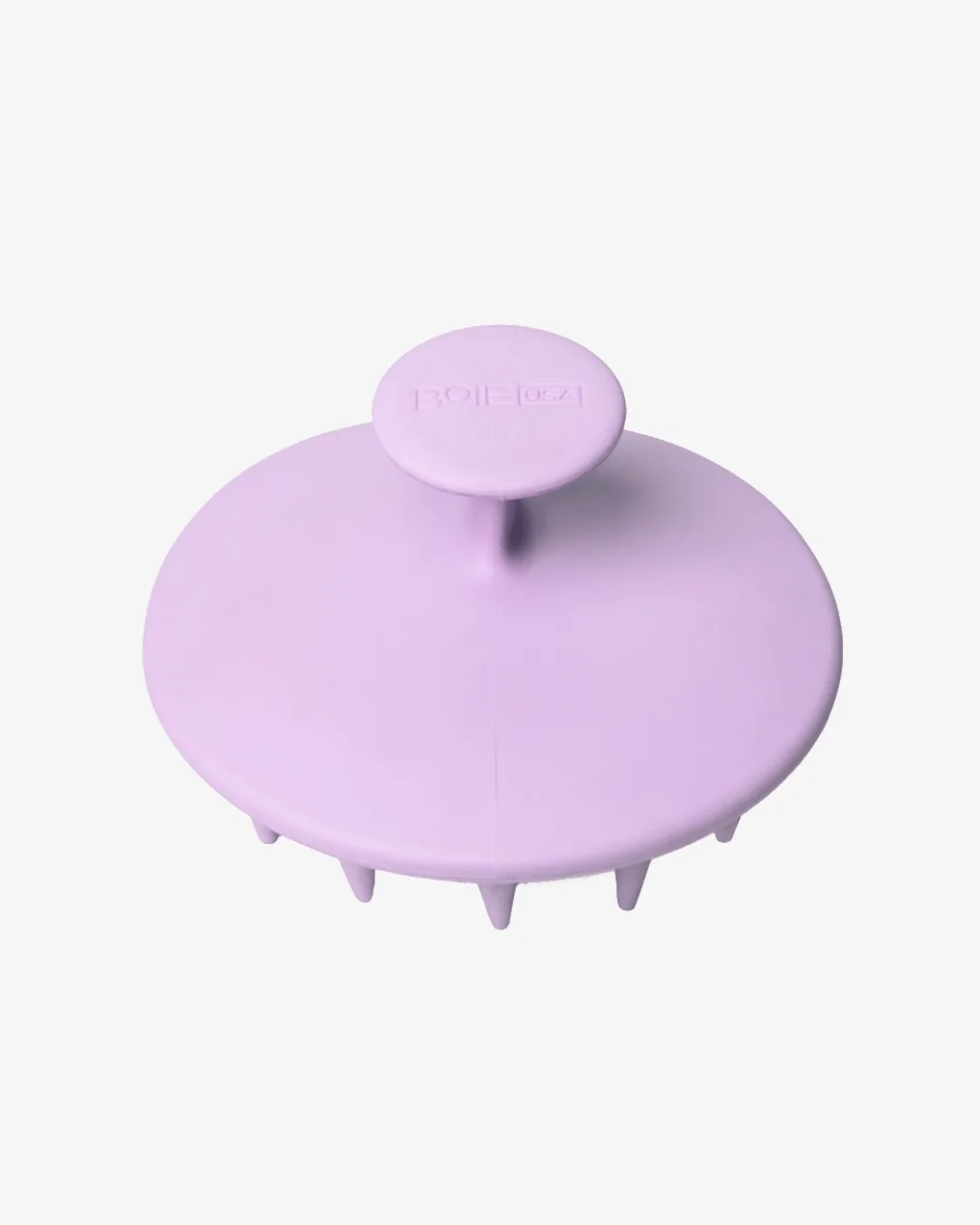
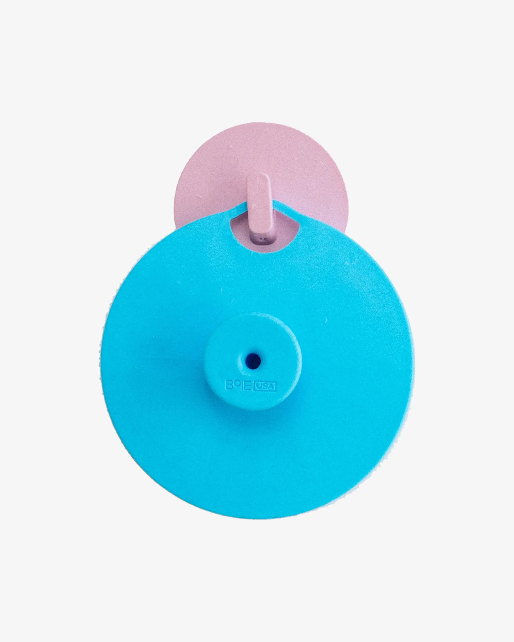
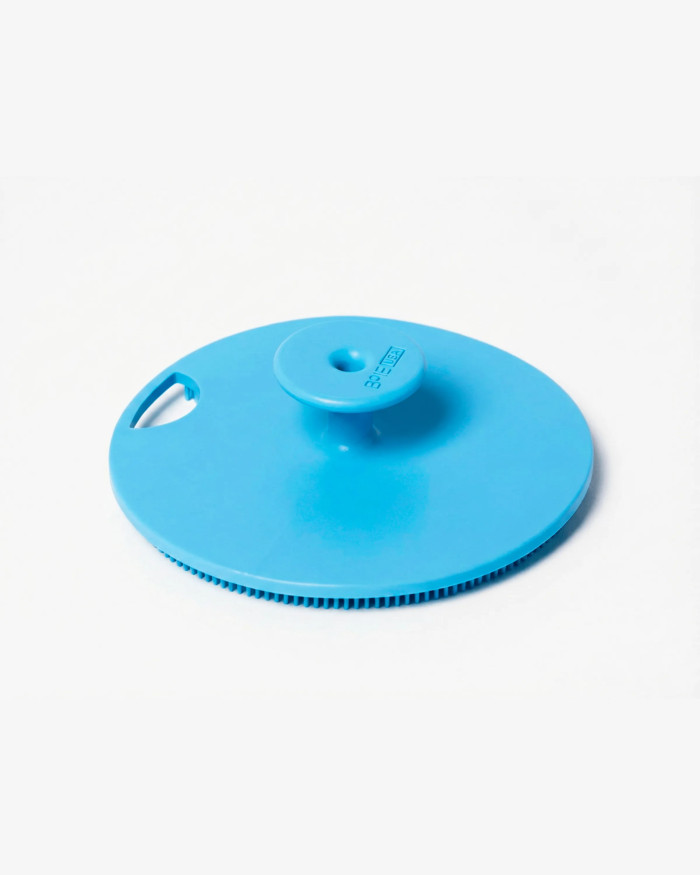
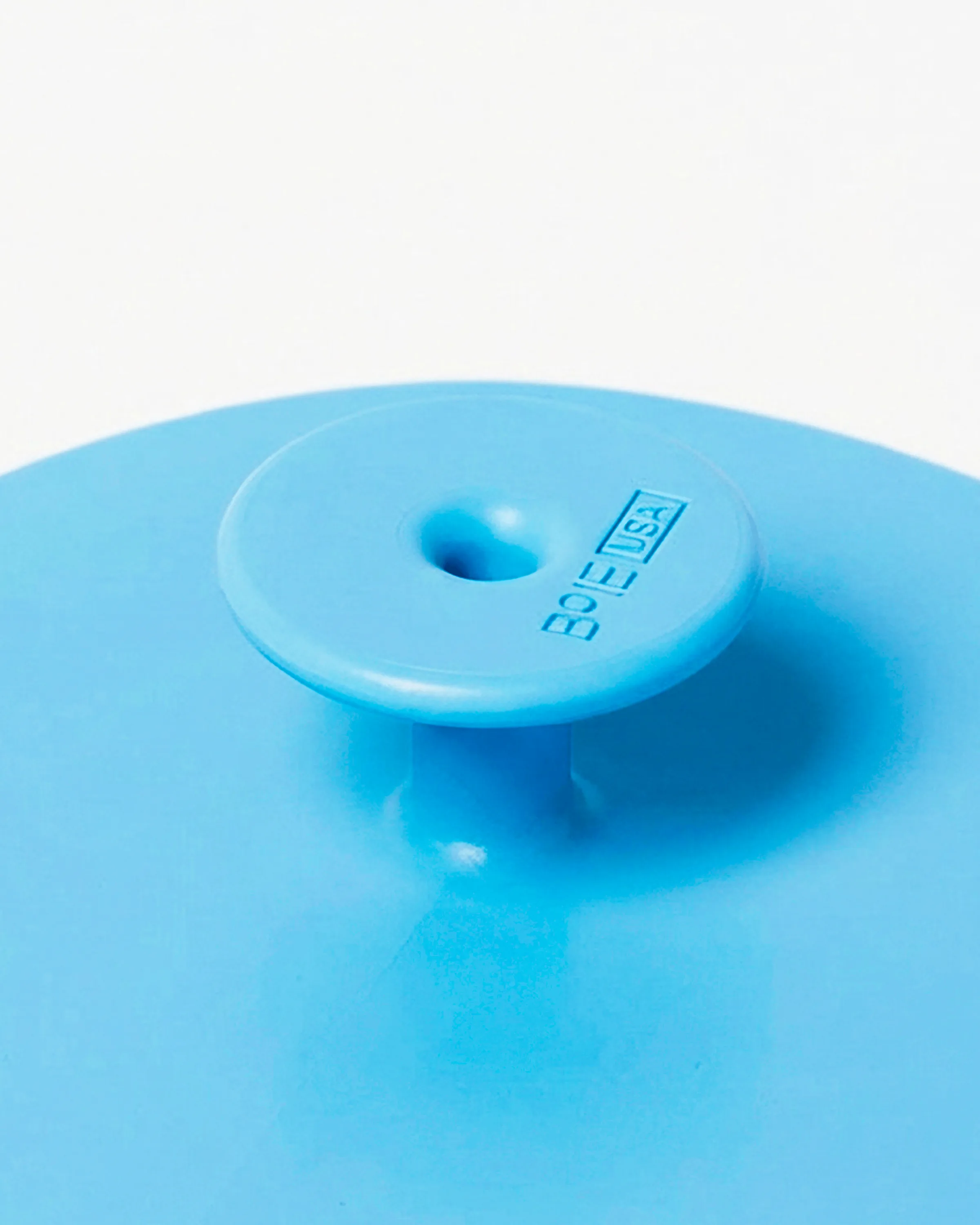
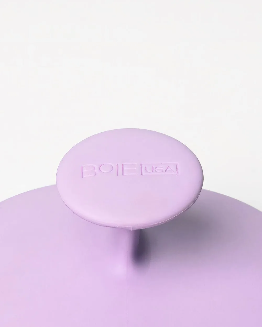
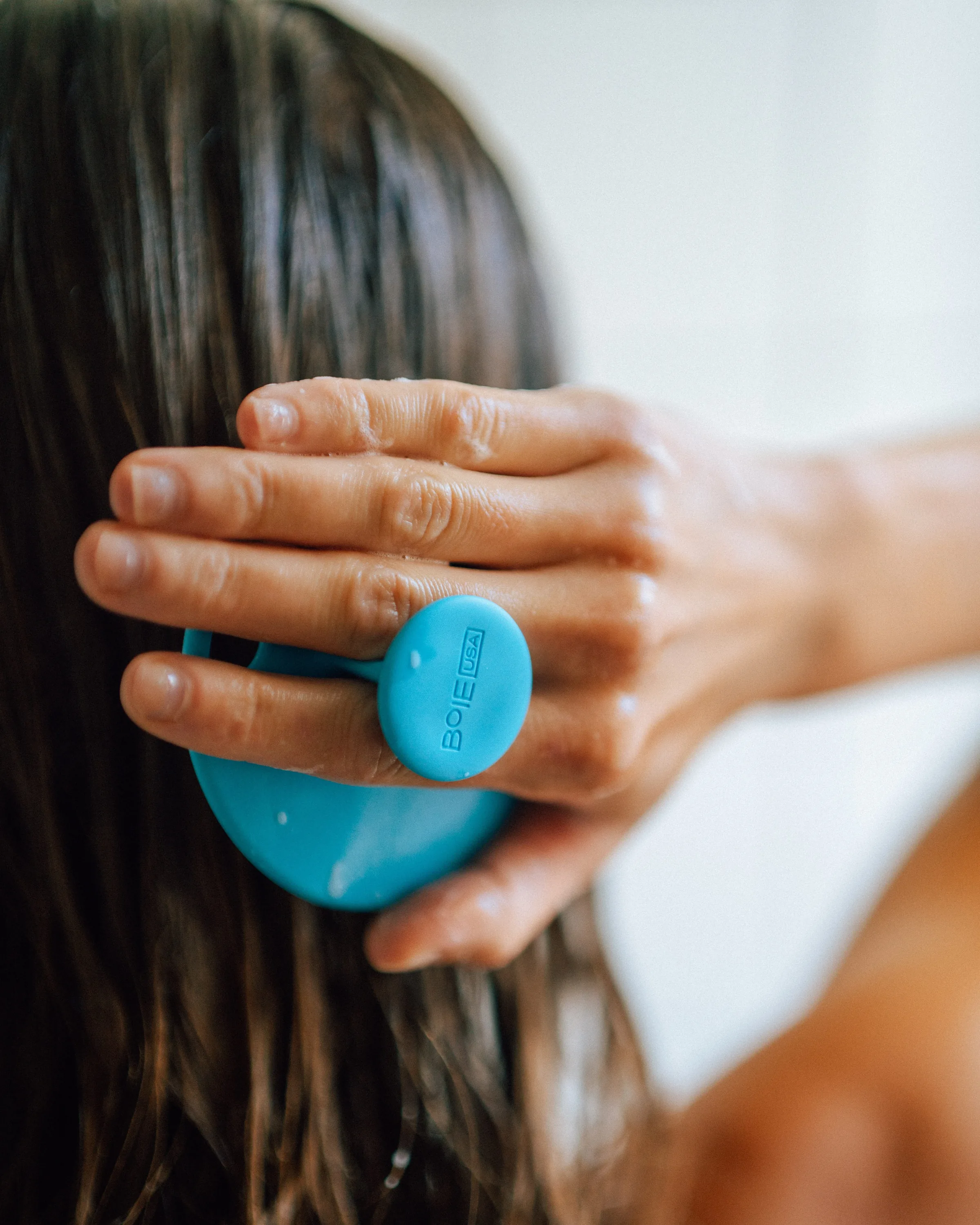
The brand speaks through the product itself. Messages like Made in USA or Made from recycled material are molded into the part, and the BoieUSA mark sits on the knob or the handle, always in the same way.
- Radii
- Proportions
- Textures
- Messages
Body Scrubber
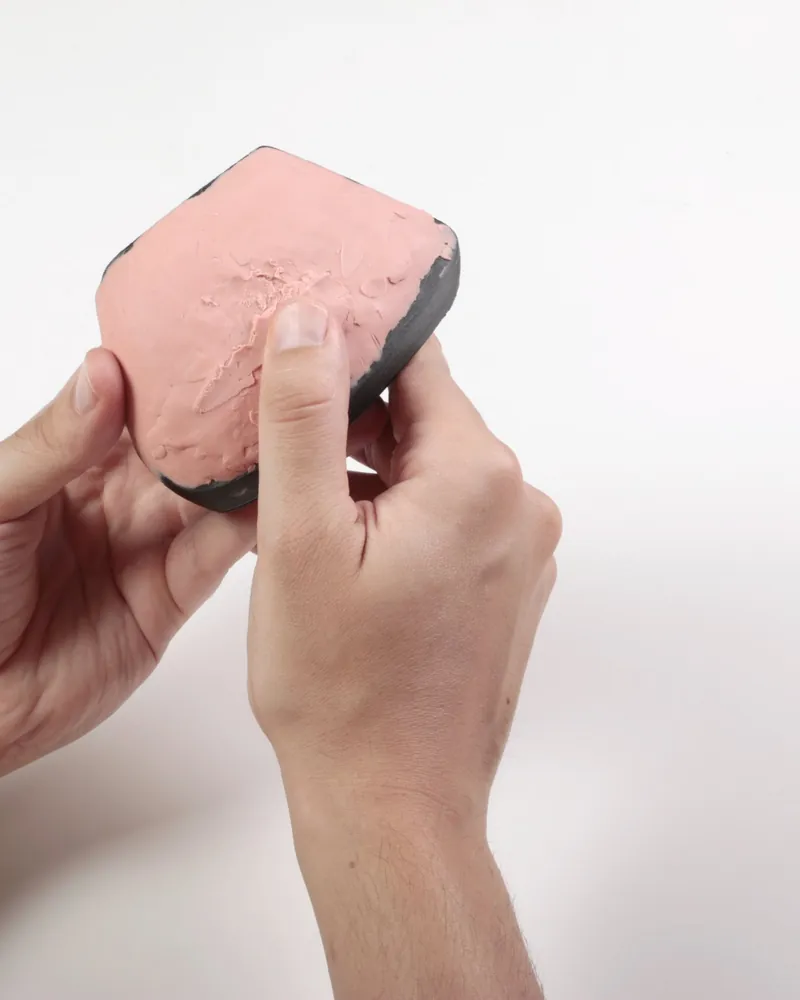
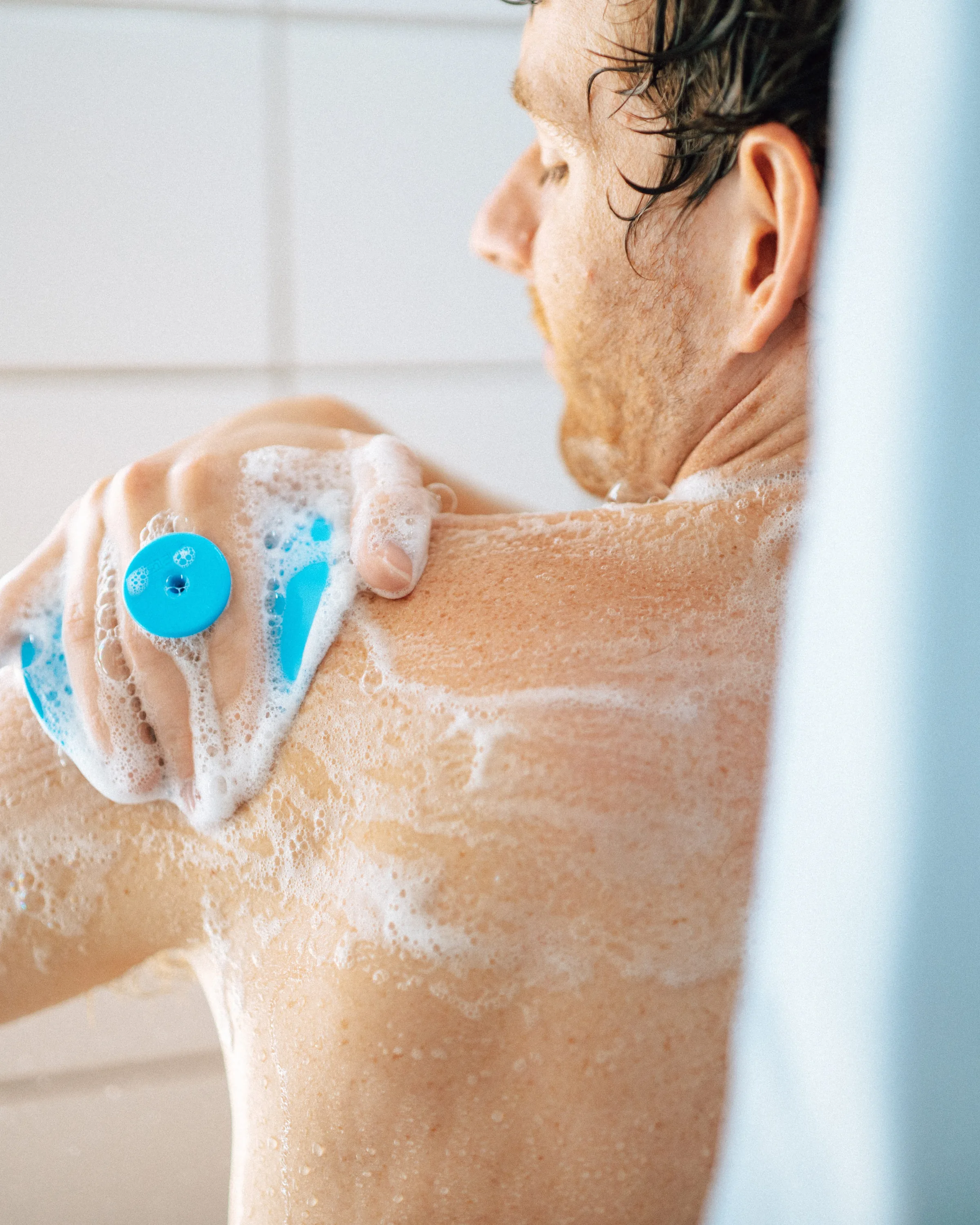
A soft scrubber for the shower, with a knob on the back that makes it easy to hold. Ultra-soft bristles with antimicrobial silver are gentle on sensitive skin, and an opening at the edge lets it hang on the wall.
Scalp Scrubber
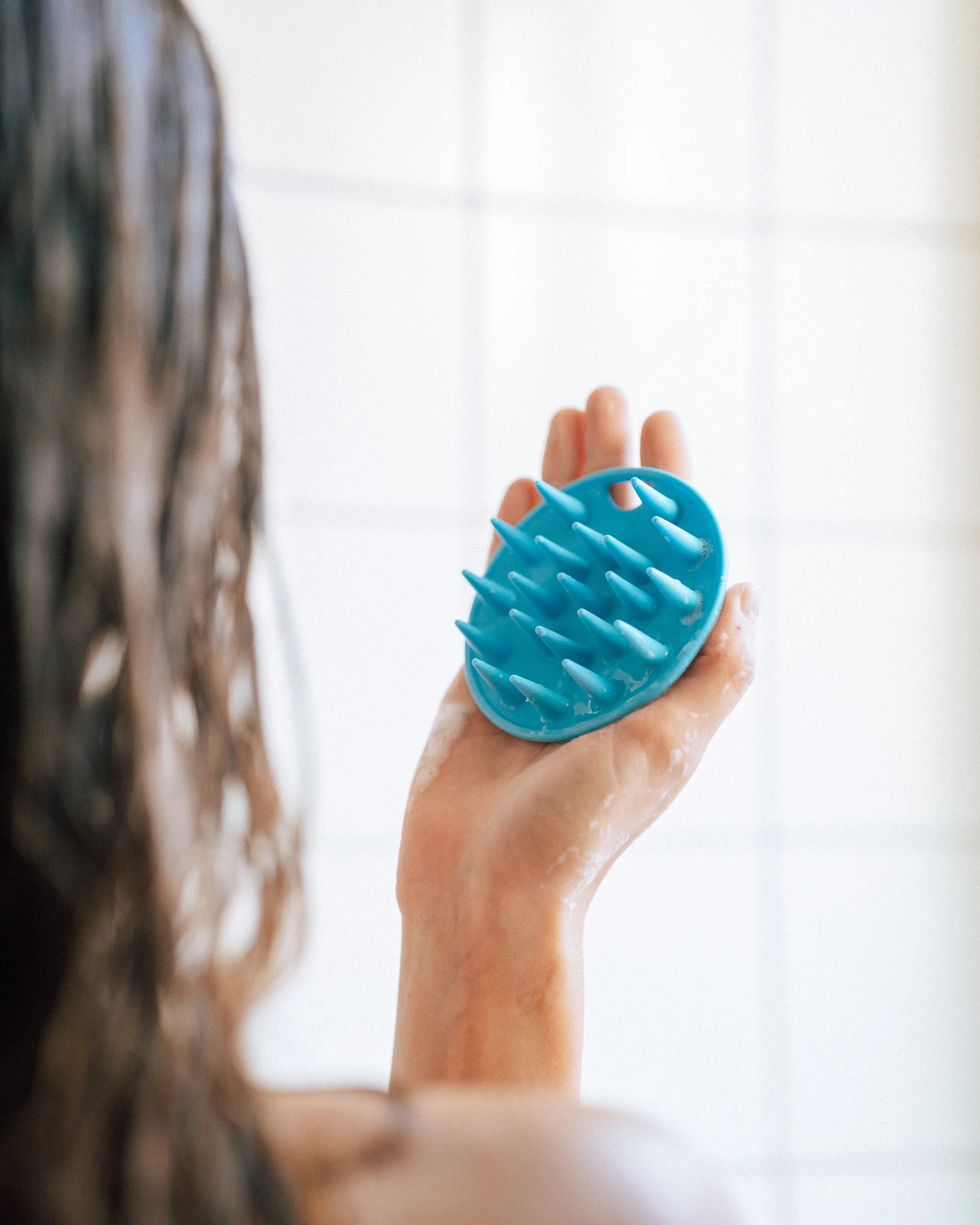
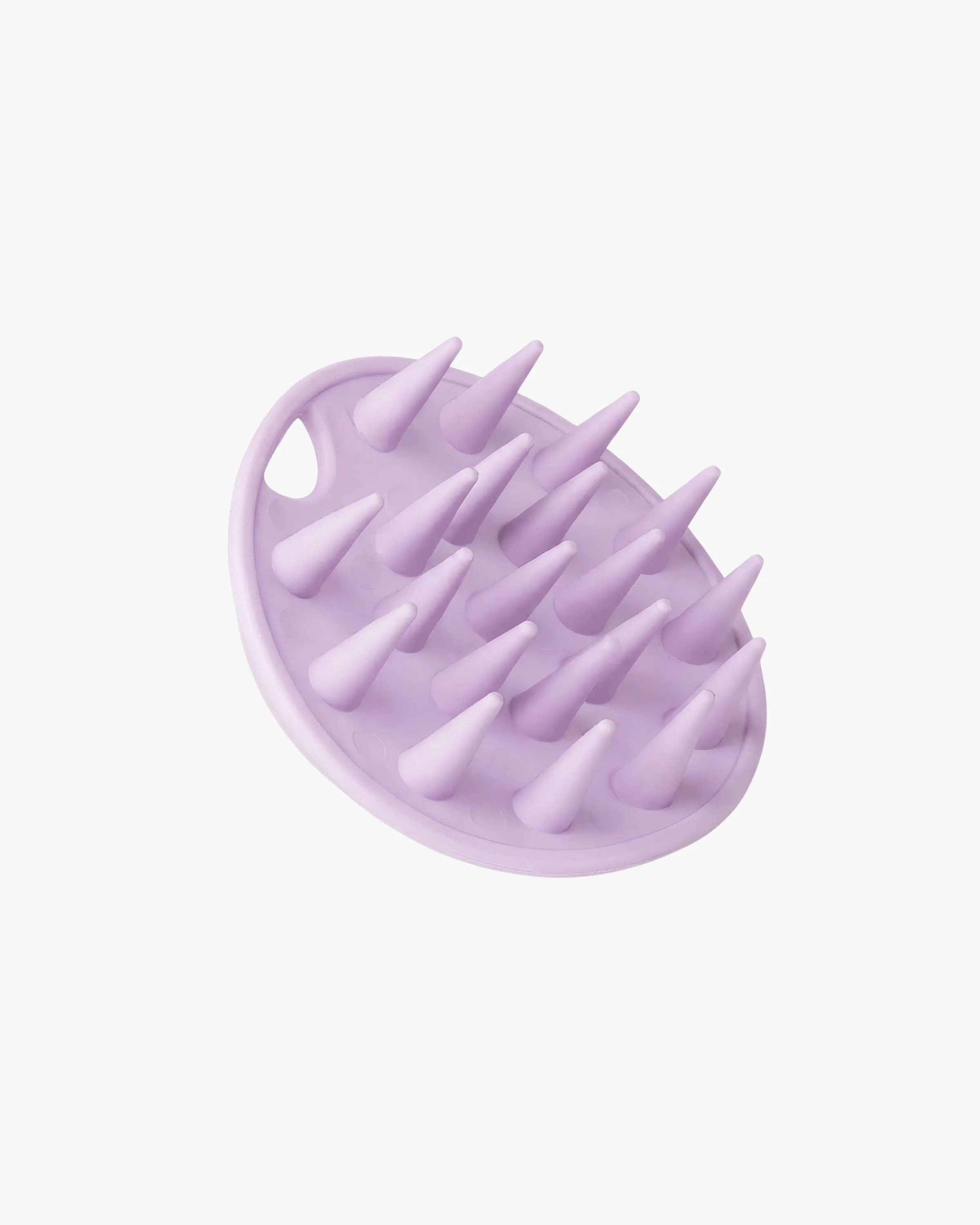
A scalp scrubber for a salon-quality wash at home. Massaging tips cleanse the scalp and help remove product buildup. The knob on the back shares the same shape and molded logo as the Body Scrubber.
Toothbrush
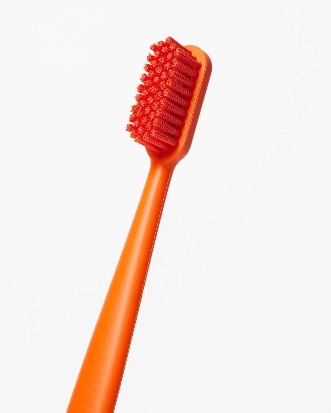
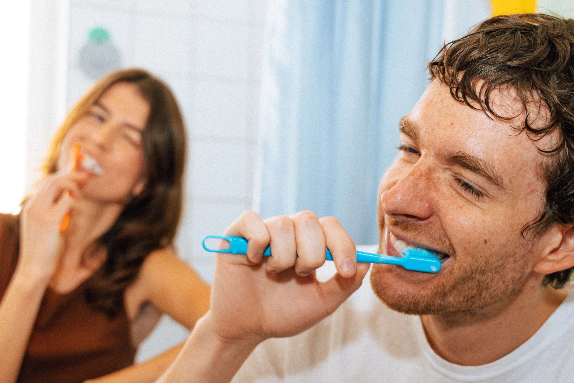
An extra soft toothbrush made in the USA, with a handle made from 100% recycled plastic. The open loop at the end lets it hang from a hook when counter space is tight.
“A brand is easier to trust when its products look like they come from the same hands. Each new product adds to the family instead of starting again.”
Product photography and video courtesy of BoieUSA. Images are shown for portfolio purposes and remain the property of BoieUSA.
Questions
What is a Visual Brand Language in product design?
A set of design rules for form, proportions, radii, textures and details that every product of a brand follows. For BoieUSA, it makes the shower and oral care range feel like one family as it grows.
How do you keep a growing product line consistent?
By defining shared rules early and applying them to each new product: the same radii and proportions, a common way to hold and to hang, and messages molded into the product instead of printed labels.
Building a product line that needs to feel like one family?
Tell me about your brand. A shared design language helps every new product belong to the range, and saves time with each launch.